Attract younger customers with a mobile-first experience
Opportunity
Rebuild the retail bank following the 2016 banking scandal by bringing new, younger customers into the bank. Innovate a digital-first mobile banking experience. Teach a new generation of customers how to manage their cash flow. Build a competitor to Finn, developed by Chase with the same goal. Project: Greenhouse.

The app offers a fresh digital alternative for consumers who gravitate to an “envelope system” to compartmentalize their finances. Greenhouse’s core innovations offer important lessons for financial institutions seeking innovative approaches to financial fitness that can fundamentally alter consumer behavior.
Role
Content strategy and design: Write voice and editorial guidelines, product copy, onboarding and help content.
Process
Partner with product owners, design managers, product and visual designers, behavioral scientists, and user experience researchers to build the design, as well as generate a new product design kit.
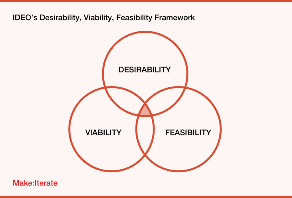
Use IDEO’s design framework to make sure we’re partnering with the right people and making the right product. Desirability is determined by the product and design teams. Viability is the product and business teams. Feasibility is product, engineering, process, analyst, and back-end systems teams. Design accomodates the backend requirements.
Agile, iterative approach to design. Team works cooperatively to prototype, engage users, and refactor. Assuring viability and feasibility along the way.
Adjacent team included developers, systems engineering, process, legal, risk, compliance, and brand.
Results
Product developed, then iterated. Was successful in the states where it was piloted. We were then informed we could not expand to the rest of the country because our back-end systems were not set up to support the application. We fought all the way to the Operating Committee, but the new CEO chose to not spend the money building the infrastructure.
Product Overview
Greenhouse was built as a cash-flow planning tool combined with a banking app. Greenhouse focuses the user on “what’s left to spend.” Money is presented from the perspective of planning for future expenses.
The app focuses the user on three numbers: the amount they must set aside for upcoming bills (“Set Aside”), the amount allocated for spending any way they see fit (“Spending”), and funds not yet allocated (“Set Aside for Later”). The push is to manage cash flow wisely and prevent overdrafts, while sidestepping the need for traditional category-based budgeting.
Think “envelopes.”
A Modern Approach to Budgeting
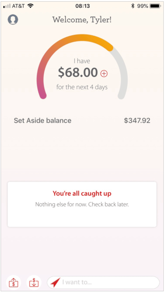
The Landing page dial shows how much of the weekly budget is left to spend. This graphic lets users decide at a glance whether a purchase fits into their spending plan. A notification box accompanies it below, prompting users to address upcoming tasks such as bill payments.
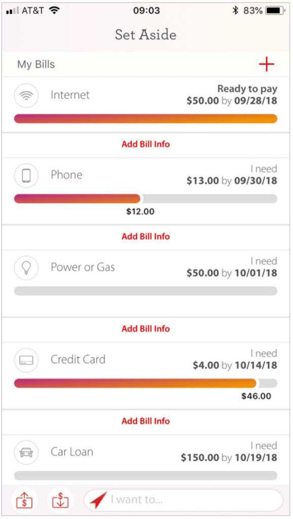
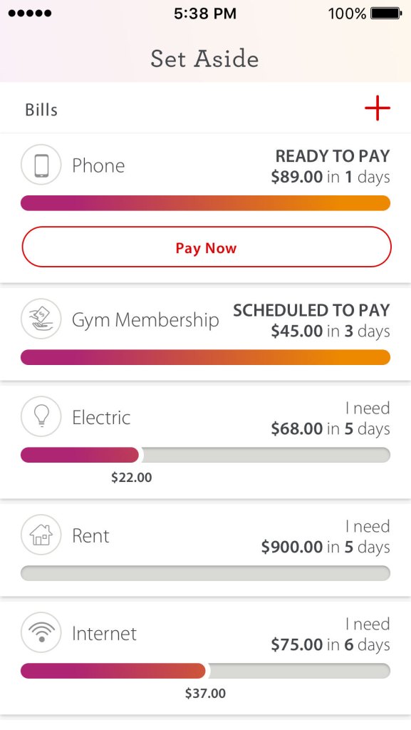
The Set Aside indicates how much money users have allocated for each upcoming bill and when it is due.
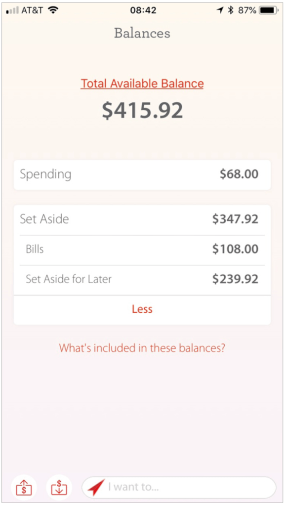
The Total Available Balance reflects the combined total of the amount owed for upcoming bills, the amount the user has allocated for those bills, and funds not yet allocated.
Adding Bills Is Simple and Uses Plain Language
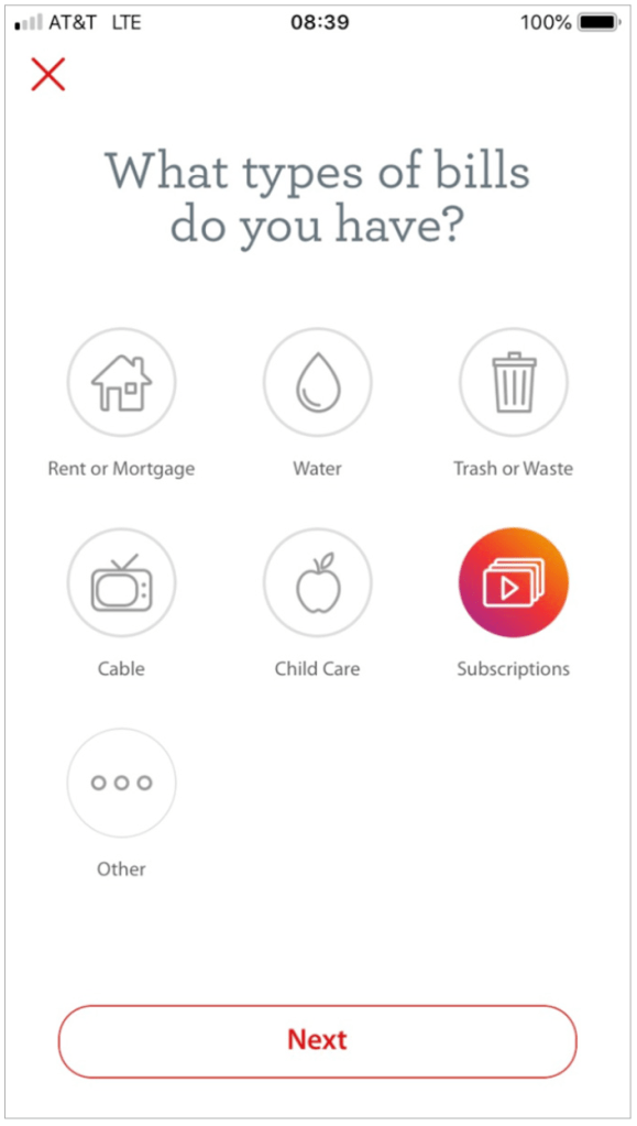
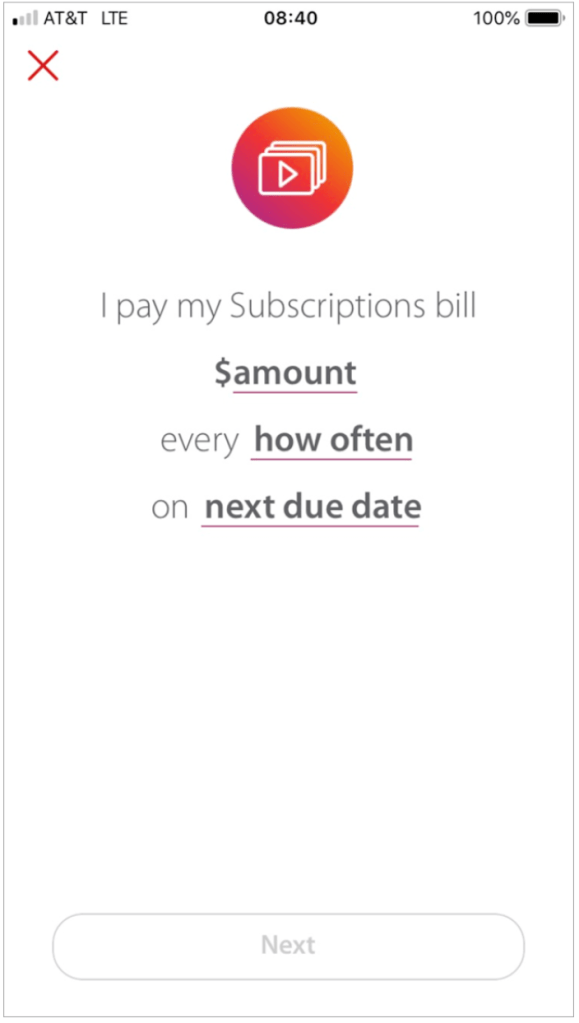
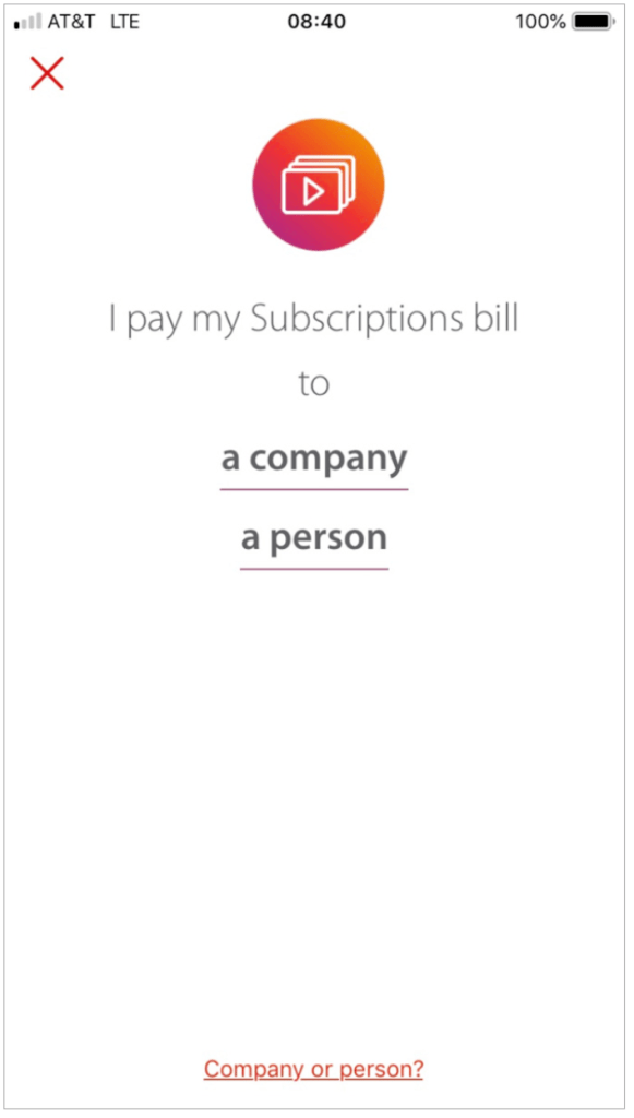
The workflow to Add a Bill follows an intuitive process that starts with bill type, amount, and frequency. It then asks the user to identify the recipient as a company or an individual.
Paying a bill is as easy as filling in the blanks.
Set and Forget the Greenhouse Budget
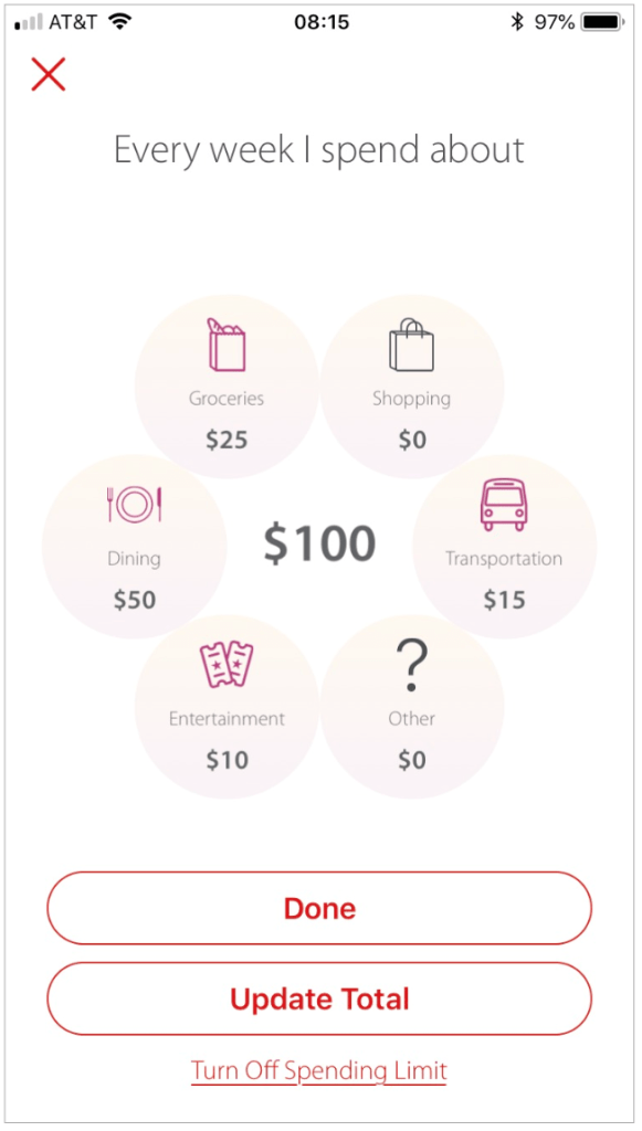
The application limits the amount of money available for spending based on a budget set by the user. The app calculates the total spending budget based on the user’s estimates of expenses by category.
Weekly, the app automatically moves money from the “Set Aside” account up to the amount required to top off the “Spending” account at budget.
Sliders Replace Text Boxes as a Means to Move Money among Envelopes
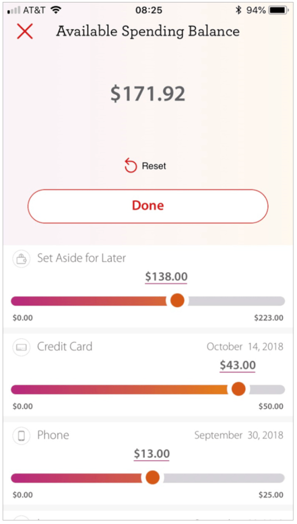
On the Available Spending Balance page, users can slide bars to shift funds among “envelopes” for upcoming bills. This enables users to move money without visiting multiple pages or doing math.
My Spending
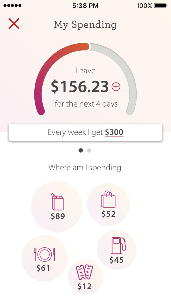
Money management and is intuitively visual. My Spending features an at-a-glance, gas-gauge-style graphic that visualizes how much money is available for the remainder of the week. Greenhouse uses slider bars to replace the need for traditional transfers.
The human brain typically compartmentalizes finances, so we offer a view that supports this. Subaccounts are dedicated to spending and bills. It extends the “envelope” metaphor to every part of the app.
Predictive Search Mixes Navigation and Help
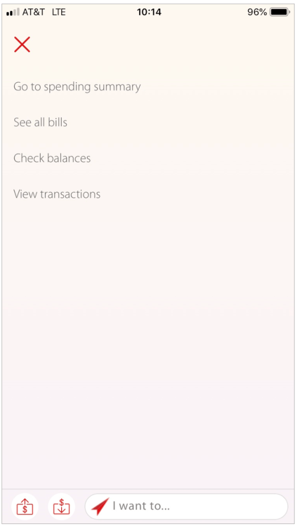
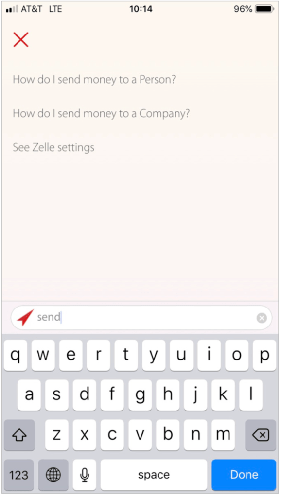
Search feature doubles as a source of information and a navigation tool, which is helpful for new users as they learn to use the app. Tapping on the search bar shows a prepopulated list of links to the app’s primary pages.
When the user enters a search term, the screen updates to a list of destinations and help pages within the app.
Portfolio | Services | About me | Why “semicolon” | LinkedIn | Resume
